
Happy Contrasts and Happy Couples …
Now that I have settled on a colour palette of 4-5, with one of those being a monotone contrast I wanted to lock in some font and typeface style. There are many fonts and distinct typefaces and they can be used to strong design advantage if paired effectively and knowingly.
“Strong contrast is produced when the differences are clearly intentional. To create intentional contrast between two elements, the general guideline is to make sure the elements differ in at least two ways; that is, at least two attributes should be different between the elements. For the purposes of this guideline, surrounding space is often considered to be an attribute as well, so leaving a gap of whitespace between two elements can count as one of the differences.”
(Matz K, 2012).
Taking into account the wisdom of Kevin Matz (2012) I choose two typefaces and fonts for specific reasons. Low and behold I have selected Helvetica font, with all its cold war beauracratic baggage, even if it does remind Paula Scher of her mother wanting her to tidy up her room (Scher, P 2008). This is because it has great usability and accessability in urban and digital environs. Although Stefan Sagmeister says you can ‘bore people with typeface’ (Hustwit, G 2007), paired with a contrasting font and especially formatted in BOLD when it gets really effective, and as perceived by David Carson, it has an all pervasive element of ‘rightness’ to it that can almost order you around (Hustwit, G 2007). Carson also thinks what is exciting is the relationship between the text and message and audience/receiver. He says don’t confuse legibility with communication! An increase in grunge typography is referenced in 90’s work and earlier typeface work but with new principles. It shows the DNA of fonts and the multigenerational aspect of them as a design and some fonts are ‘almost in our blood’ they are so diffused in culture (fonts used in bibles?) Baskerville Cambridge edition of the bible (Hustwit, G 2007).

Typography’ in 60pt Fry’s Baskerville ready for printing on a Stanhope press (Photo: fizzkitten, Flickr)
So for my second typeface/font to pair and contrast with Helvetica, I have chosen one of my long time faves, Baskerville Old Face – don’t ask me why, I just love it. It is a derivative of Baskerville, one of our oldest fonts which starts life with a fascinating history …
It was designed in 1754, it has stood the test of time – I must check if it is used in horror or vampire texts!!! It has crisp edges, high contrast, generous proportions. Birmingham bred John Baskerville starts out as an illiterate, learns calligraphy and really likes it and becomes a self taught perfectionist. Baskerville font is categorised as a transition font or typeface, as it sits between classical fonts and high contrast modern fonts. John Baskerville seeks to create a font with accuracy and proportion that is beautiful to the eye (Baskerville J. 1758). It emerges from technological process and progress of improving the printing technique (form follows function with the presses). Baskerville uses bright white paper and deeper darker more saturated inks. His doggedness drives standards for printing presses higher than in the past. Baskerville redesigns the platens from wood to copper/metal to get smoother even joins of platens, he has sharper cut edges, uses thinner tympanum and even warms the plates first (Yay C, 2010).
Contrasting cut in letter forms and process of printing, gloss of paper and intensity of ink equals refinement of product outcome. Slow start to life for Baskerville and not that popular in UK, but his widow sells the equipment to France and in Europe the font takes off and is well received. It is diffused in Italy and evolves to fonts of modern typeface of DIDOT and BODONI (I am drawn to both funnily).
1766 – Bristol’s Fry Foundry creates its own Baskerville font
1917 – Bruce Rogers discovers a Baskerville font in a book in a Cambridge book store, might have been a bible? He becomes printing advisor to Harvard University Press, he recommends a casting of the original matrixes and Baskerville has a revival in the 20th Century.

Type specimen for Fry’s Baskerville (left) and Zuzana Licko’s Mrs. Eaves (right). Mrs Eaves is Baskerville’s mistress!! ? Connect Cosmopolitan for modern liberated women.
1996 – Zuzana Licko designs contemporary Baskerville called “Mrs Eaves’, who was JB’s mistress! Who says fonts are not emotional and can’t represent passion and intrigue! All these feelings have underpinned Licko’s design concept title. Baskerville is popular for calligraphy influences, swashes and Licko puts increased ligatures in her Mrs Eaves font to mimic the style but with a modern twist – again the multigenerational aspect of design influence. Licko says screening and examining Baskerville typeface inspires her fonts Tarzan and Solex.
Why is Baskerville so popular? – it is an elegant book face, it excels at pure type texts, script only and is totally admired for its legibility and refined beauty – Go Baskerville !!
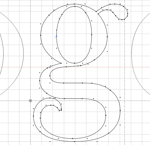
image of John Baskerville and Page from Virgil
John Baskerville (Source: Birmingham Museum); Virgil Aeneid with expansive margins and fine alignment, 1757 (Source: Typefaces for Books)

Baskerville in use: The Metropolitan Opera logo by Pentagram, poster by Bradley Hoston, Kate Spade New York logo, Better Homes and Gardens magazine, Canada wordmark, Baskerville ampersand from The Ampersand letterpress poster, Baskerville Type greeting
David Dunning (2012) at Cornell sums up the findings:
Baskerville is different from the rest. I’d call it a 1.5% advantage, in that that’s how much higher agreement is with it relative to the average of the other fonts. That advantage may seem small, but if that was a bump up in sales figures, many online companies would kill for it. The fact that font matters at all is a wonderment.
Baskerville seems to be the king of fonts. What I did is I pushed and pulled at the data and threw nasty criteria at it. But it is clear in the data that Baskerville is different from the other fonts in terms of the response it is soliciting. Now, it may seem small but it is impressive
Read more at http://hypervocal.com/news/2012/want-to-be-taken-seriously-use-the-font-baskerville/#wOcHvQKKGFGTgGLU.99
Meanwhile, the common digitisation of Baskerville Old Face bundled with many Microsoft products features dramatic contrasts between thin and thick strokes. This makes it most suited to headings, especially since it does not have an italic.[41][42]
- “Storm Type Baskerville Original Pro”. Monotype. Retrieved 9 July 2015.
- Jump up^“Baskerville Old Face”. Fonts In Use.
https://en.wikipedia.org/wiki/Baskerville – viewed 17/12/16
And I use Baskerville Old Face for the font in my design lab logo to connotate history, trust and something worth taking a chance on. It is a familiar and also reasonably ubiquitous style that users have experienced in their information lives for a long time and looks like heading that way into the future.
The second contrast element I have built into my typeface is the element of ‘all caps’ as a contrast, with additional colour contrast in the attempt to highlight an even simpler message within the script of my poster design. I want the words in the script to act as positive, energetic and inviting signifiers to enhance the positive usability of my design’s readability and legibility (Matz, K 2012). Also according to Matz (2012) users’ actions trigger functions and I want the user to act positively with the interface of my poster to trigger the action of engagement with the Design Laboratory, so I am attempting to map the intertexts of the poster framing so that all texts lead to a positive emotional engagement and a strong sense of pleasure, interest and wanting to know a lot more. If the texts (words, graphics) are the controls of my design then I want to arrange them in a logical way and include relatable real world objects to help embed the message of my design (Matz, K 2012). To this end I have decided a bricolage of old and new world iconography can be included to support the orientation of the information in the poster (what comes first, who is hailing me, how do I find out more?) and reflect a Helical Spiral of ideology.
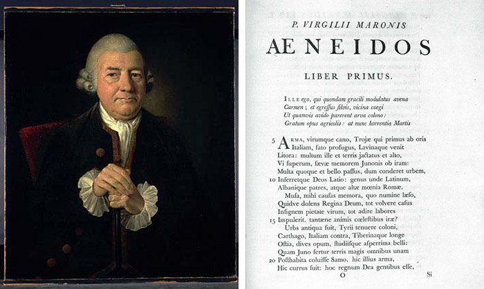
Another example of mapping to provide logic and consistency can be seen in the work of designer Shaun Rafferty and his mapping of Australia via the design features of fruit and vegetable logos, the logos providing consistency for audience to make sense of the product over a narrative timeframe and I am hoping to achieve the same with the logo for my design laboratory ; have it as an easily recognizable logo.

Cartonography.com, Shaun Rafferty [image], Hot 100 presented by Alessi, Gourmet Traveller May 2016
“The Cartonography exhibition was the installation of a collection of Australian fruit and vegetable cartons. The cartons were installed in order of their latitude (the furthest north first, and the furthest south last), to create a map of fruit carton art from across Australia.”
For more information please visit the Cartonography website.
Like Shaun’s wonderful images of carton design, my humble poster seeks to be as friendly and pleasing on the eye. It has a number of font and typeface draft options, a colour scheme that I’m happy with, a simplicity that will hopefully make it easy to engage with so far and a number of texts to rep for my global address ideals. I have utilised standard iconography (wingdings) for my contact details to reflect readability (Lidwell et al 2012 pp. 198-199) and consistency. I have not decided on the final images or iconography yet but aim for consistency (Matz K 2012) in some of the elements to support its success. I still have to source the tech for my audio link for visually impaired or those who just can’t wait to hear more LOL! But I am aware of the Heirachy and getting the foundations right first before I start to decorate. Good design should almost appear fluid and I can add the tech later if it has to be done that way.
So here tis so far ….

I just need to prototype it more for contrast and resolution on DPI ranges and play some more seriously with the contrasting texts and layout logic – now where did I put the digital duct tape?
References:
Bierut, Michael 09.29.16 Essays
http://designobserver.com/feature/the-typeface-of-truth/35428 – viewed 17/12/16
Dunning, David 2012 Via: http://hypervocal.com/news/2012/want-to-be-taken-seriously-use-the-font-baskerville/#ixzz4T4rSsLFR – viewed 17/12/16
Hustwit, G 2007, Helvetica, viewed 17 August 2016, <https://commons.swinburne.edu.au/logon.do?.page=items/9cdc83bc-8cb3-4e3d-bac9-c2f5aa6e2838/1/>.- viewed 28/12/16
Lidwell, W Holden, K & Butler, J 2010, Universal principles of design: 125 ways to enhance usability, influence perception, increase appeal, make better design decisions, and teach through design, Rockport Publishers, Beverly, MA.
Matz, K 2012, Don Norman’s design principles for usability, Architecting Usability, 28 June, viewed 22 July 2016, <http://architectingusability.com/2012/06/28/donald-normans-design-principles-for-usability/>.
Matz K, 2012 How to build a visual hierachy to express relationships between page elements, Posted on July 15, 2012 – viewed 30/12/16
Matz K, 2011 The impact of visual design on usability, Posted on May 20, 2011
http://architectingusability.com/2011/05/20/the-impact-of-visual-design-on-usability/
– viewed 30/12/16
Yay, C 2010, Know your type: Baskerville,
http://idsgn.org/posts/know-your-type-baskerville/ – viewed 17/12/16

Francis, there is some really fantastic work in your third blog post. It is great to see the energy, colour and enthusiasm you bring to your responses. Indeed, I use Baskerville myself, and it was fantastic to learn more about it through your research. Moreover, you are on the whole addressing all of the criteria in the brief. The one substantial issue is that you are doing way too much (nb I have this problem myself [I believe it is a product of passion!]. This quantity means that you are overstepping the limits of the brief. This is a problem, because the brief in design at least provides the limits required to bring the idea out in the appropriate form and place. This doesn’t mean you shouldn’t do the same amount of work. I just think your energy and insight will benefit greatly in the long run by, for example, drawing and organising such fascinating information into an on-going diary, before then distilling and reconfiguring it into – in this instance – a response that fully engages and thereby clearly unlocks the potential in the brief.
Indicative mark: 6 – 9 / 10
LikeLike
Hi Frances,
I am thoroughly enjoying reading your blog entries and you do so well in delving into the weekly concepts. I love that you have gone with Helvetica as your font, cause let’s face it, it just looks good! What would Paula Scher know anyway!!
Look forward to reading your final post.
Cheers,
Kellie
LikeLike
Hi Fran,
Nice to see your design coming along, I am on the side of Helvetica I understand that it can seem regimented but when used with the correct size, spacing, and colour I love it. I agree that Baskerville is a fantastic font, it has a classic style the serif’s on letters like the lowercase g and y have such a great aesthetic quality.
Ken
LikeLike