
2nd blog post
Serious Play …..
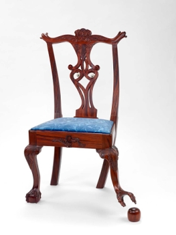 ‘Oops! Chair’, Jake Cress 1997
As many a great designer has advised, good design is serious, not solemn and we should think latitudinally and not be afraid to play with design. However, Week 3 of our learning materials sees us examine the importance of design in the business world and its profitability, driving and promoting business into the future, with the client and buyer of design collaborating. You can create a 1/20 ratio of dollar profit with good design, hence 33 Billion dollars is spent on design in the UK annually (Design Council 2014). So, I consider the aspects of ‘expectation effect’ and how I will incorporate it in the poster design. Also, my own ‘classical conditioning’ may affect the way I design the poster and will my mental models (systems matches interpretation) match those of the target audience (Lidwell et al 2010)
. 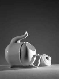
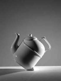
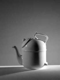
Figure 3:The Ronnefeldt “tilting” teapot. Put leaves on the shelf (seen through the opening on the teapot to the left), fill with hot water, and lay the teapot on its back. As the tea darkens, tilt the pot. Finally, when the tea is done, stand the teapot vertically, so the water no longer bathes the leaves and the brew does not become bitter. (Author’s collection. Photo by Ayman Shamma.) from Don Norman’s ’emotion and design’ (2002).
Designers work as problem solvers (Fadell T. 2015), so it stands to reason they would gravitate to collaborative work to combine individual values and experience that informs design. But the poster must take into its structure design ethos and design activism, such as indi, makers mark etc and consider why humans design in the first place, what motivates them. In Tony Fadell’s video “the first secret of design is noticing” (2015), he advises to shake off habituation, it hampers good design thinking and ‘look broader, look closer, think younger’. I decide to apply this ideology to my poster structure and referencing Dieter Rams of the famous Braun Design Lab, go right back to pen and paper and drawing board technique in the creation and ideation of the poster design. I want a simple uncluttered playful design, that has a great ‘entry point’ (Lidwell et al 2010) in its primary image and script and effects a ‘savannah’ as a preferred place to experience (Lidwell et al 2010) in terms of framing, balance and aesthetics.
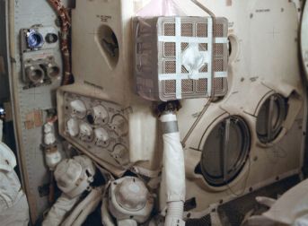
Image: Apollo 13 CO 2 Scrubber duct taped, definately not a ‘savanna’!
Week 5 of our learning materials sees us focus on the democratisation of design looking at the move from designer as ‘auteur’ to participatory design (collaborative, constructivist). Dieter Rams advises us that users of good design have positive experiences when things are clear (ren@rt 2013) and I aim for my poster to have clarity, a high level of accessibility and taking into account the democratisation of design around the world, designing a poster for designers to engage with a design laboratory is a design that is truly at its heart for everybody in its ideation. I have a design process diagram (Engeler-Newbury B. 2015) for the poster and now just need some critique and feedback …
and here tis my design process …
finnesdesignprocessassess1part21
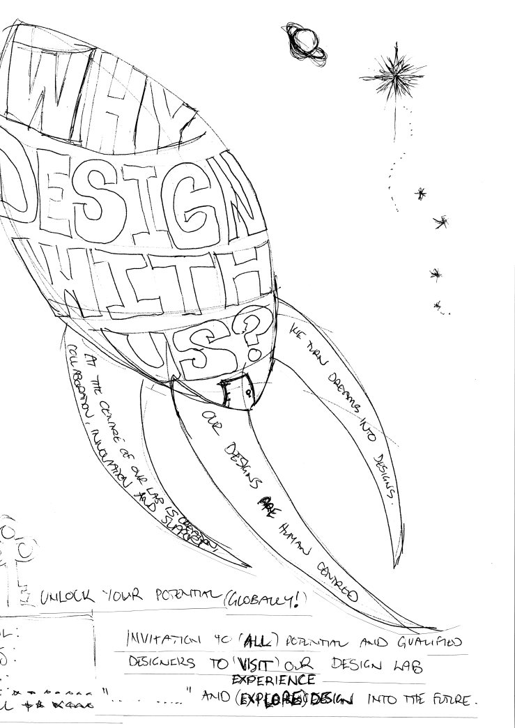
Playing around with layout and script …
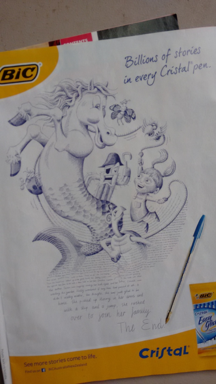
Cristal Pens advertisement, minimal colour combinations – pale, desaturated except the golden hue
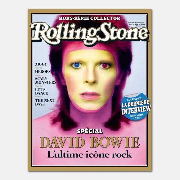
French Rolling Stone Magazine cover, increased colour combinations – desaturated to high saturation, mixed with monotones – I like this better!
REFERENCES:
10redants 2013, Principles of good design, 13 July, viewed 22 July 2016, <https://www.youtube.com/watch?v=RWoprlPMBnA>.
Cress J. 1997 ‘Oops! Chair’ [image] Smithsonian American Art Museum Gift of the artist © 1997, Jacob Cress 2002.53A-B Not currently on view
http://americanart.si.edu/collections/search/artwork/?id=71623 – viewed 11.12.16
Design Council 2014, The value of design, 2 September, viewed 22 July 2016, <https://vimeo.com/73619059>. – viewed 5.12.12
Engeler-Newbury, B 2015, ‘The design process’ [image], from The design process [lecture].
Fadell, T 2015, The first secret of design is… noticing, TED, March, viewed 22 July 2016, https://www.ted.com/talks/tony_fadell_the_first_secret_of_design_is_noticing – viewed 3.12.16.
Lidwell, W Holden, K & Butler, J 2010, Universal principles of design: 125 ways to enhance usability, influence perception, increase appeal, make better design decisions, and teach through design, Rockport Publishers, Beverly, MA.
Norman, D. A. (2002). Emotion and design: Attractive things work better. Interactions Magazine, ix (4), 36-42
http://www.jnd.org/dn.mss/emotion_design_at.html – viewed 11.12.16
Rolling Stone Magazine Cover, 2014, ‘Rolling Stone Hors-Série Collector N 20 – David Bowie 2014’ [image]

Huge thanks to WW for his critique, it is substantial and super supportive and I have attempted to tidy up my blog site and make aspects more accessible, hopefully some comments will flow 🙂
LikeLike
I have received commentary on my second blog post from my eLA.
It is a kind and substantial critical analysis of this second post and goes as follows …
Hi Francis
While I can see you have been putting a lot of work into your blog posts, it is not altogether clear to me which is which? You can correct this by even more clearly titling your posts. It is great to see you drawing widely from the field, pulling information from one discipline into another. This is a creative way to work, but it also requires really really clear communication, as – habitually – people are equipped to think vertically as opposed to horizontally. This is really a problem that society has: all the evidence suggests we need more cross-disciplinary thinking (because conventional thinking leads to more and more of the same), but society / industry (eg grant bodies etc) are not set-up to recognise it. Anyhow, there is no shortage of energy or passion in work. I just think you need to organise and communicate it in ways that really provide insight into your thoughts / discoveries. This would, for instance, mean ensuring that the ‘Leave Comments’ button is easy to find on your blog. Keep up the great work.
Indicative mark: 8.5/10
LikeLike