
1st blog post
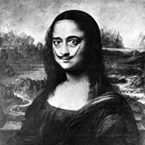
Hierachy of Needles …
In Tim Brown’s words in his video presentation, week one of our TP, this blog attempts to create a small humble design movement ( University of Michigan 2010), regards the brief for our first assessment in Teaching Unit DDD10007: Introduction to Design Principle and Processes. By designing a blog site for this purpose, hopefully I follow Brown’s advice, putting design in the hands of everyone, not just the designer(s) (University of Michigan 2010) by inviting feedback and commentary on the posts entered for each blog component.
In designing a design, that attracts and engages with designers, as to why design as a technology and art is so important, and in the broader specialty of Media Studies, I choose ‘business document’ from the selection advised. I’ll attempt a corporate poster promoting DESIGN as a technology and social tool, the poster being an address to hail and interpellate design candidates with the skill.
How will I go about structuring and framing the design? What do I want the design to do? How do I want it to function? Indeed, how do I sieve through all the learning principles and processes so far, that make up the huge haystack of concepts and ideas, innovation and creation codes for design and decide what to do first?
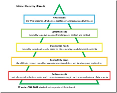
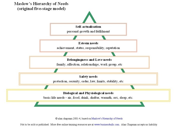
I will turn to a table of priorities, inspired by Abraham Maslow’s 1954 work, ‘Motivation and Personality’, (Lidwell et al, 2010 pp.124-125) known as the ‘Hierachy of Needs’. This will take me through a series of phases of design and innovation where you do the first things first, starting with Functionality and building on the tiers above from Reliability, Usability and Proficiency to the apex of Creativity (Lidwell, et al 2010). The foundation tiers will take me through processes of function, framing, and flexibility/usability tradeoff, where it can invoke the 80/20 rule as inspired by Joseph M. Juran in 1951 (Lidwell et al, 2003). This rule, also called ‘the vital few’ will see me designing word count, with the fact that if I blog in more than one language, the function of the design within the design brief of the word count is compromised. So far I am impressed with the ‘80/20’rule, as it is a good guide to concentrate on resources in design, making sure that at least 20 % of my design gets at least 80% functionality – that’s what I call efficient!
The most important bottom tier of design, Functionality, although considered a purist aspect and of little value being linked to the minimal emotional sphere of ‘physiological’ (Lidwell et al, 2010) will ultimately determine success of meeting basic needs to progress to higher more valued needs.
So at this phase of my poster design, I’ll take inspiration from Paula Scher and Phillipe Starck and if I get stuck or confused wading through all the principles and processes and need to find the starting point in the haystack, I will remember the hierarchy, find the compass needle and head from the bottom up.
References:
Lidwell, W Holden, K & Butler, J 2010, Universal principles of design: 125 ways to enhance usability, influence perception, increase appeal, make better design decisions, and teach through design, Rockport Publishers, Beverly, MA.
Scher, P 2008, Great design is serious, not solemn, TED, May, <https://www.ted.com/talks/paula_scher_gets_serious> – viewed 11.11.16,
Starck, P 2007, Design and destiny, TED, March, <https://www.ted.com/talks/philippe_starck_thinks_deep_on_design>. – viewed 14.11.16
University of Michigan 2010, From design to design thinking, 25 August, <https://www.youtube.com/watch?v=lGOTwFvkfhU>. – viewed 8.11.16

My eLA, William Wilding, has assessed my first of four quarterly posts on this blog site and handed down his summary of the content and associated components. It is thoughtful and thorough in detail and there is much I can learn from it – it is very appreciated.
“Nice start Frances. I can clearly see here that you have put a lot of effort into your first entry. It is good to see you focus on the hierarchy of needs, as it is not only a critical but also a productive element in design. It is also great to see you incorporating the wider discussion themes from Brown and Scher and Stark: indeed, Maslowe’s hierarchy of needs is deeply human, and these designers are each engaged with how design can firstly recognise humanity’s innermost needs while secondly producing outcomes that facilitate its growth. Design is interesting in this respect as it sits between the sciences on the one hand and the humanities on the other hand. As a relatively new academic discipline it is moreover developing its own culture. Designers in general are more image or picture based, where people in the sciences are more numbers based and people in the humanities are more word based. Recognising that that designers need to speak or collaborate with the sciences and the humanities, senior design academics are encouraging junior design academics to encourage their students to prepare their visual materials and written reports in simple, pared back ways. While am of course happy to see you playing with the language (because it demonstrates an engagement with the material), in your next post I would like to see you experiment with even more direct, more objective, more dry language. This is what is expected in the academy, and is part of what we are exposing you to at SOL. Beyond that, in your first entry, you could have started to include a first basic iteration of your design – though I can see that you instead described it. I look forward to seeing your work develop. You have made a great start / contribution to the unit.
Examples of design in area of specialisation are provided and clearly linked to weekly design concepts. Explanations are clear and mostly linked to weekly learning content.
Design concept shows evidence of iterative development over time. Design methods and approaches are applied appropriately with only minor inconsistencies in application or explanation.
The Harvard referencing system has been used with minor errors in detail.
Indicative mark: 7 – 7.5 / 10”
Ta V Much WW, much obliged 🙂
LikeLike
I have found asking myself questions before I put pen to paper a really useful tool. Why, why, why
LikeLike